Stacked Bar Chart
A Stacked Bar chart displays data values as bars, with each bar sub-divided by color segments. The height of a color segment is determined by the category's contribution to the bar's total value.
Stacked bar charts help in comparing parts of data to the whole.
Creating a Stacked Bar Chart
Zoho Analytics supports the following types of stacked bar charts.
Single Series Chart with Color
You can create a stacked bar chart for a single metric (Y-axis) grouped by multiple dimensions i.e., by Color.
Follow the below steps to create a single series stacked bar chart with the color category.
- Open the chart editor. Drop columns as given below.
- X-Axis shelf - Drop the dimension column (usually a text or date column)
- Y-Axis shelf - Drop the metric column
- Color shelf - Drop the column to categorize by color
- Click the Click here to Generate Graph button. A single series stacked bar chart with the color category will be created.
The following animation illustrates how to create a stacked bar chart, showing average ticket resolution time by month and channel.
Multi-Series Chart
You can create a stacked bar chart comparing multiple metrics (Multi Y-axes) grouped by the same X-axis. Each stack component represents one Y-axis metric.
- Follow the below steps to create a multi-series stacked bar chart.
- Open the chart editor. Drop columns as given below.
- X-Axis shelf - Drop the dimension column to categorize the data
- Y-Axis shelf - Drop multiple metric columns
- Click the Click here to Generate Graph button. A multi-series bar chart will be created.
- Merge Axes and select the chart type as a Stacked Bar.
The following animation illustrates how to create a stacked bar chart, showing tickets resolved on time and tickets that are delayed.
Horizontal Chart
In the Horizontal Chart, data series is represented by horizontal bars. This looks better when a chart having quite a few bars is being viewed on a narrow layout, like on a mobile.
Follow the below steps to create a Horizontal stacked bar chart.
- Open the chart editor. Drag and drop columns as given below.
- Y-Axis shelf - Drop the dimension column (to categorize the data)
- X-Axis shelf - Drop the metric column
- Color shelf - Drop the column to categorize by color
- Click the Click here to Generate Graph button. A horizontal stacked bar chart will be created.
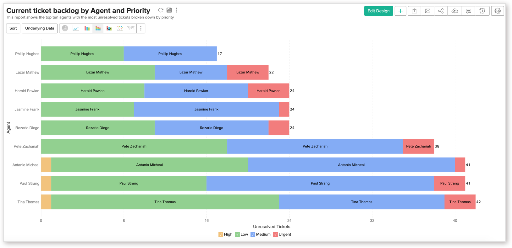
The following animation shows how to create a stacked bar chart, showing ticket backlogs by Agent and Priority.
100 % Stacked Bar
100% Stacked Bar plots the contribution of each category in the percentage of the total in a group, assuming the total in a group is 100%. You must select the Base field by which grouping will be done.
Follow the below steps to create a 100% stacked bar chart.
- Open the chart editor. Drag and drop columns as given below.
- Y-Axis self - Drop the dimension column (to categorize the data)
- X-Axis self - Drop the metric column
- Color self - Drop the column to categorize by color
- Once you add all columns, set the summary function of the metric column as 100% Group.

- The Show Data As Settings: 100% Group dialog will open. Select a base column to group the value. This column is considered as the whole (100%) and the contribution of each category is calculated based on this.

- Click the Click here to Generate Graph button. A horizontal stacked bar chart will be created.


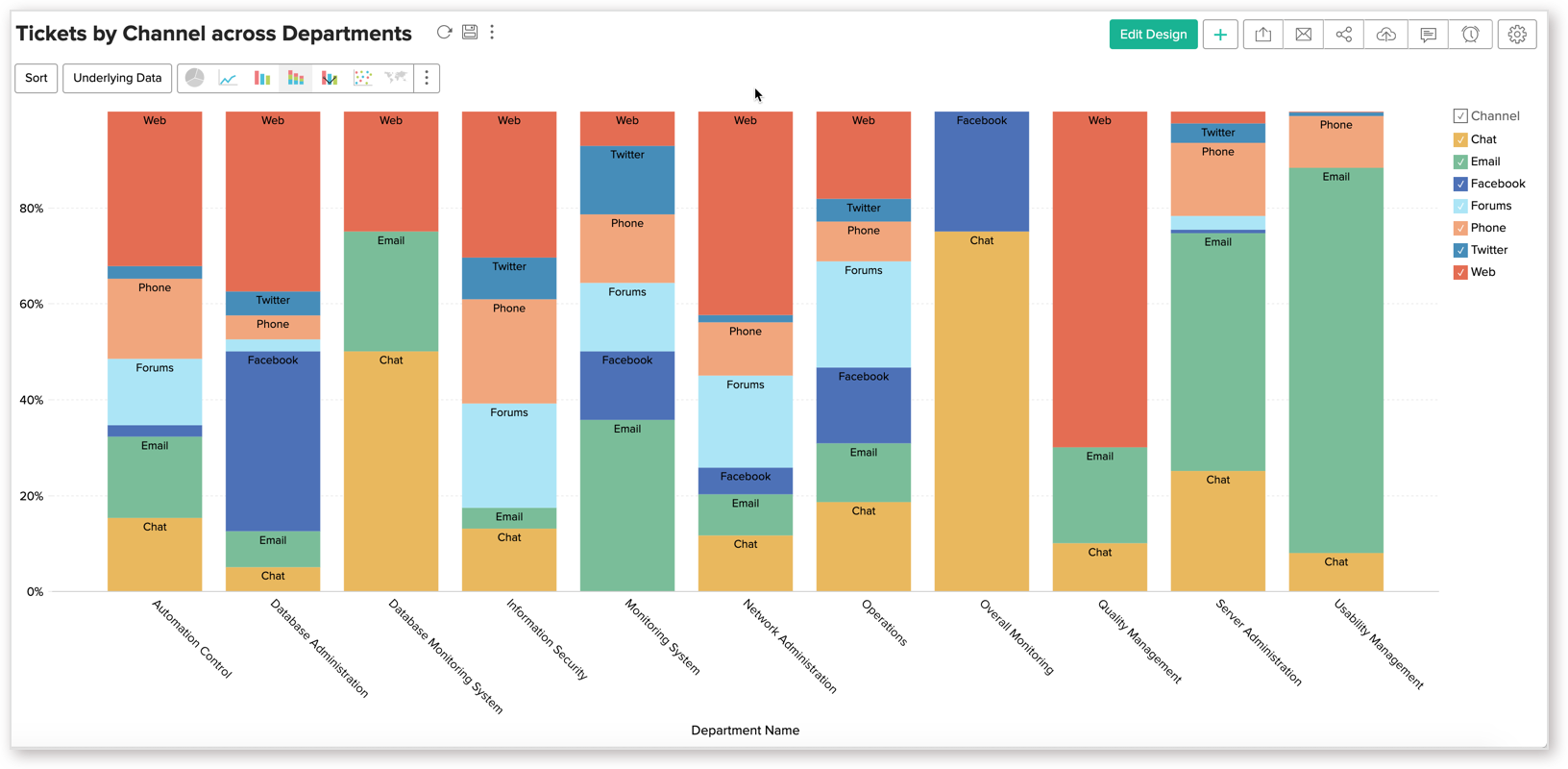
The following animation shows how to create a stacked bar chart, showing Distribution of Tickets by Channel.
Add a Chart label
You can either add the Y-Axis value as label or a column (X-axis or color column) as a label.
Add Y-Axis Value
Follow the below steps to add Y-axis value as chart label
- Open the chart.
- Click Settings icon. The Settings page will open.
- Open the Axis tab.
- In the Data Label section, select Show corresponding Y-axis value as data label on the chart checkbox to add the value of each color as data label.
- Select Show Total Stack value checkbox to add the total value of the stacked bar as data label.
- Click Apply. Y-Axis value will be added as data label.

Add a column value
Follow the below steps to add a column value as chart label.
- Open the chart.
- Click Edit Design.
- Drop either the X-Axis or the Color column in Text field.
- Click the Click here to Generate Graph button. The corresponding value will be added as data label.

Possible combinations for creating Stacked Bar Charts
The following combinations of column types are possible when creating bar charts.
| X-axis | Y-axis | Color | Text | Tooltip |
| Case 1 | Aggregate | Dimension | Aggregate/ Optional | Aggregate/ Optional | Aggregate/ Optional |
| Case 2 | Dimension | Aggregate | Dimension/ Aggregate | Aggregate/ Optional | Aggregate/ Optional |
| Case 3 | Dimension | Multiple Aggregate | - | Aggregate/ Optional | Aggregate/ Optional |
| Case 4 | Aggregate/ Optional | Dimension | Dimension | Aggregate/ Optional | Aggregate/ Optional |
- Dimension: A column with Actual Value function applied over it. For numeric columns, the Actual value will be divided into Actual Measure, Actual Dimension and Actual Range, from which you can choose the appropriate function.
- Aggregate: A column with an aggregate function (sum, average, count, etc) applied over it. This also includes the aggregate formula columns.