Customizing a Chart
- Title and Description
- Axis Settings
- Borders and Colors
- Format
- Legend Settings
- Adding Threshold
- Chart Drill Down Path
- Customizing Chart Color
When designing a chart, Zoho Analytics offers a wide range of options to customize the chart and improve the overall appearance in different ways. In this section, we will discuss the various options provided by Zoho Analytics to customize the chart that you create.
Watch the below video to get an overview.
Title and Description
Zoho Analytics provides options to customize the chart title, description and data display in the General tab.
To customize these settings :
- Open the corresponding chart.
- Click Settings option in the toolbar. The Settings screen General tab will open as shown in the following screenshot.
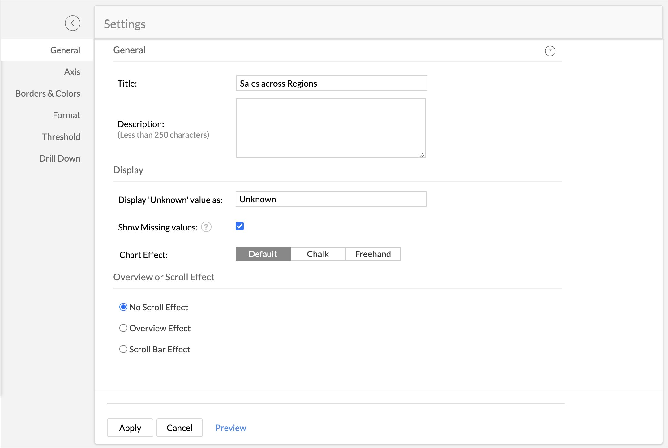

The following table describes various options in general tab.
| Option | Description |
| General | |
| Title | Specify the unique title of the chart. This is mandatory. |
| Description | Specify a description of the chart. This is Optional. |
| Display | |
| Display 'Unknown' value as | specify the value you wanted to display in the chart if data contains null or empty values. |
| Show Missing Values | Select Show Missing Values to plot the chart including the data points (date/categories) which does not have any corresponding value in the underlying data. Deselecting this will skip these points in the axis. |
| Show Data Label | This option will be available in case of Pie and Funnel Chart. With this you can set whether to display the percentage or value as data label over the corresponding section. You could also choose to show chart without the data label. |
| Show Conversion Rate | Select this to display the conversion rate of the funnel in percentage, by comparing the value of the last slice with the first slice in the funnel. |
| Funnel Design | Select the funnel design. The available options are.
|
- Click Apply once you have set all required options.
Axis Settings
Zoho Analytics will automatically set values for chart axes properties such as X-axis and Y-axis labels, axis range, interval between labels, etc., while creating a chart. You can also customize these properties to suit your needs using the Axis tab in the Settings screen.
To customize axis settings:
- Open chart and then click Settings option in the toolbar.
- The Settings screen will open. Click the Axis tab. You can also open the Axis tab by clicking the settings icon next to X/Y Axis in Edit Mode.
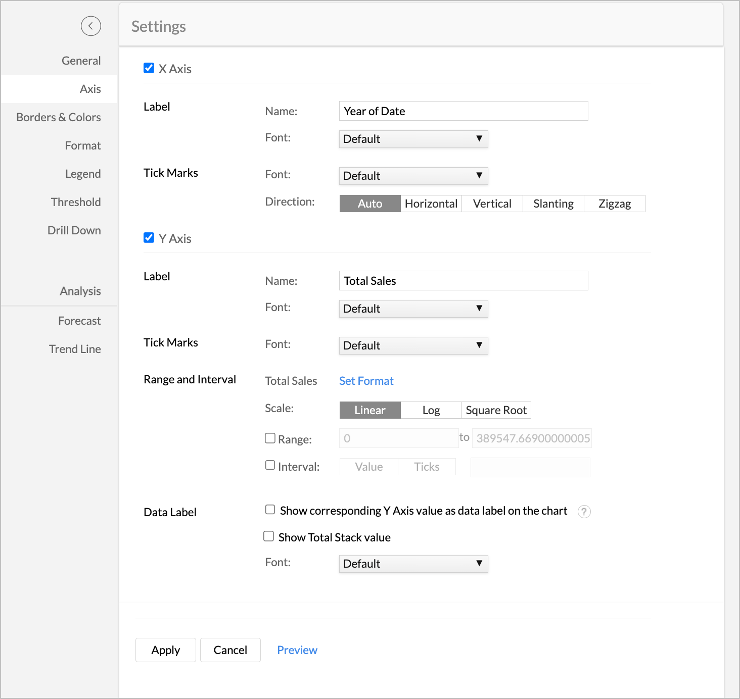

The following table describes various options available in Axis tab.
| Option | Description |
| X Axis | |
| Label | This option consists of two fields. They are: Name: Text field to specify the name of the X-axis. By default, the name of the corresponding column will be set as axis label. Multi-column drop-down displaying options to customize the font style, size and color of the X-axis label. |
| Tick Marks | Font: This option is used to set the font style of the tick marks in X axis. It contains a multi-column drop-down displaying options to customize the font style, size and color of the tick mark. Direction: This option can be used to set the orientation of X-axis tick labels. Available options are:
|
| Format | This option will be available only for a numeric column added in the axis. The Format link to format the numeric data for the tick marks. These options will be similar to that of the table column formatting. For more details refer here. |
| Range | Zoho Analytics will automatically calculate the X-axis range based on the maximum and minimum values in the data series. If required, you can set a custom range by selecting the Range check box and then entering the maximum and minimum values in the corresponding fields. This option will be available only when numeric data columns are added to the X-axis and the chart type is set to Line, Area or Scatter chart. |
| Interval | Zoho Analytics will automatically determine the interval between axis labels based on the axis label length and the size of the chart. If required, you can set a custom interval by selecting the Interval check box and then enter the interval value in the corresponding field. This option will be available only when numeric data columns are added to the X-axis and the chart type is set to Line, Area or Scatter chart. |
| Y Axis | |
| Label | This option consists of two fields. They are: Name : Text field to specify the name of the X-axis. By default, the name of the corresponding column will be set as axis label. Font: Multi-column drop-down displaying options to customize the font style, size and color of the X-axis label. |
| Tick Marks | Font: This option is used to set the font style of the tick marks in X axis. It contains a multi-column drop-down displaying options to customize the font style, size and color of the tick mark. Direction: This option can be used to set the orientation of X-axis tick labels. Available options are:
|
| Data Label | This option can be used to display Y-axis values as data labels in the chart. On selecting this option a text string which displays the Y value corresponding to each data point will be added. Note: In case, if you have dropped a column in to the Text shelf when creating a chart, then it will override the data label setting provided. |
| Format | This option will be available only for a numeric column added in the axis. The Format link to format the numeric data for the tick marks. These options will be similar to that of the table column formatting. For more details refer here. |
| Range | Zoho Analytics will automatically calculate the X-axis range based on the maximum and minimum values in the data series. If required, you can set a custom range by selecting the Range check box and then entering the maximum and minimum values in the corresponding fields. This option will be available only when numeric data columns are added to the X-axis and the chart type is set to Line, Area or Scatter chart. |
| Interval | Zoho Analytics will automatically determine the interval between axis labels based on the axis label length and the size of the chart. If required, you can set a custom interval by selecting the Interval check box and then enter the interval value in the corresponding field. This option will be available only when numeric data columns are added to the X-axis and the chart type is set to Line, Area or Scatter chart. |
| Scale | This option allows you to specify how to scale the label ticks. Available options are:
|
Note:
- The Axis tab is not applicable for Pie and Web chart types, as they do not have any axis.
Borders and Colors
When a chart is created, Zoho Analytics will set the default background and border for the new chart. However, you can customize these setting to enhance the look and feel of the chart. The Borders & Colors tab in the Settings screen provides various options to customize the chart appearance.
- To customize the chart appearance:
- Open the chart and then click Settings option in the toolbar.
- The Settings screen will open. Click the Borders & Colors tab.
- Customize the chart and then click Apply.
The following screenshot illustrates the Borders & Colors tab.
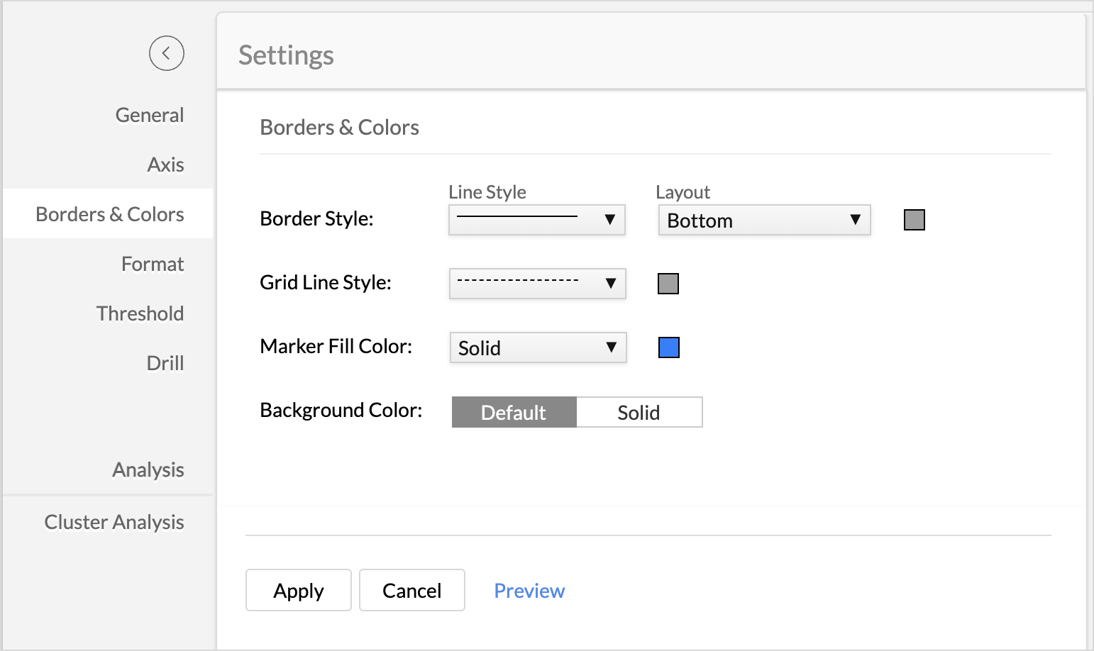
The following table describes various options available in the Borders & Colors tab.
| Option | Description |
| Chart Fill Color | This option is used to customize the default color of the chart fill for single data series. |
| Border Style | This option is used to customize the chart border. This consists of two options.
|
| Grid line Style | This option is used to customize the chart grid line. This consists of two options.
|
| Background Color | This option is used to set the chart background. Available options are:
|
Format
Zoho Analytics allows you to format all the columns used in the report creation individually. You can also format the data labels and tooltips individually.
Let us see how to format the below chart. Here, the data labels with extended decimal values make it difficult to interpret the chart. This is where formatting comes in handy.
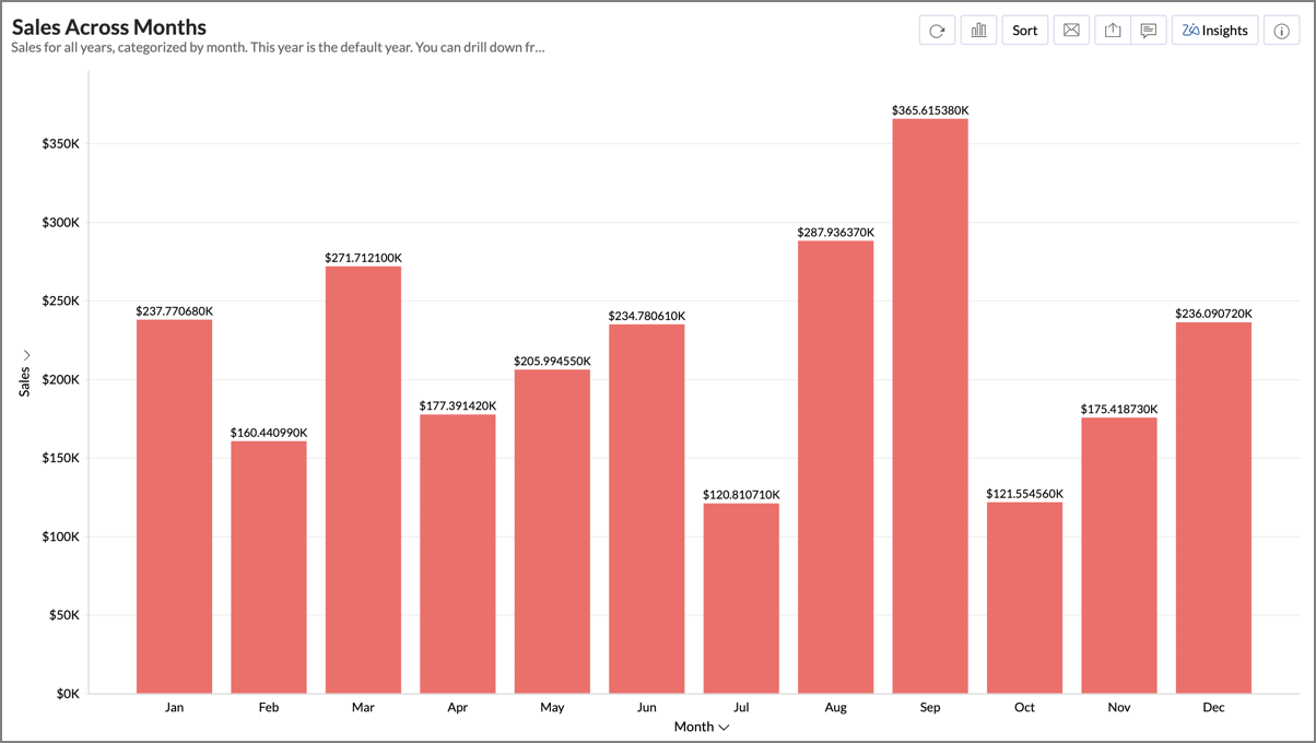
You can format the respective column resolve this issue in the following three methods.
- Open the table.
- Right-click the column and select Format Column from the drop-down menu.
- The Format Column dialog will open.
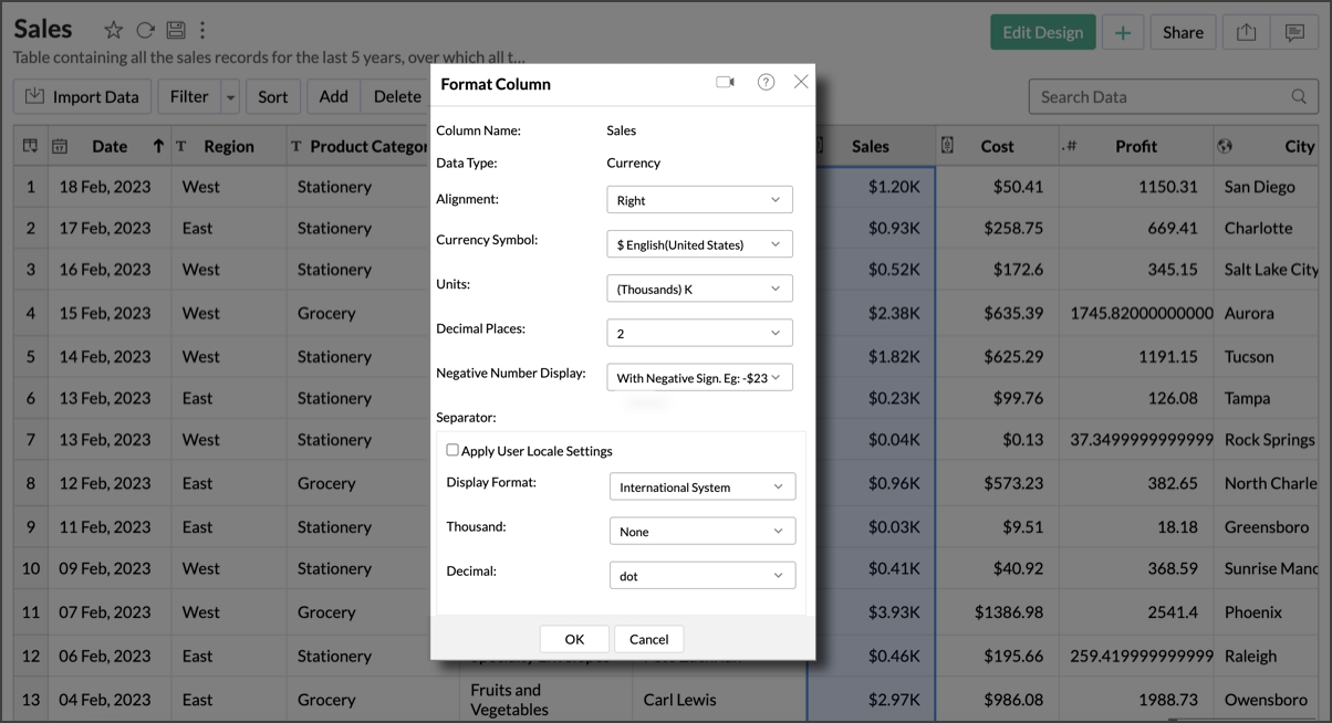
- From the Decimal Places drop-down, select the number of decimal places to round-off. For example, if you choose '2' from the drop-down, this will round-off the units after the decimal point to two.
- Apart from decimal places, there are various other options that you can use to customize your data. Also, please do note that the formatting options in this dialog will change based on the data type of the column. Click here to learn more.
- Click OK.

Method 2: From the Chart Designer Page
- In the Chart Designer page, hover the mouse over the field you want to format.
- The Settings icon will appear on the right. Click the icon and select the Format option.
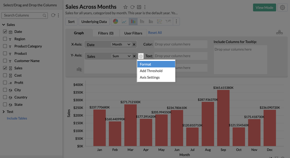
- The Format Column dialog will open. Continue the steps mentioned in Method 1 to format the column.

Method 3: Settings Tab
- Click on the Report Settings icon on the top right corner of the report.
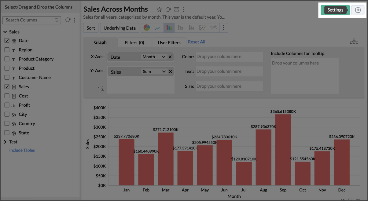
- The Settings page will open. Select the Format tab.
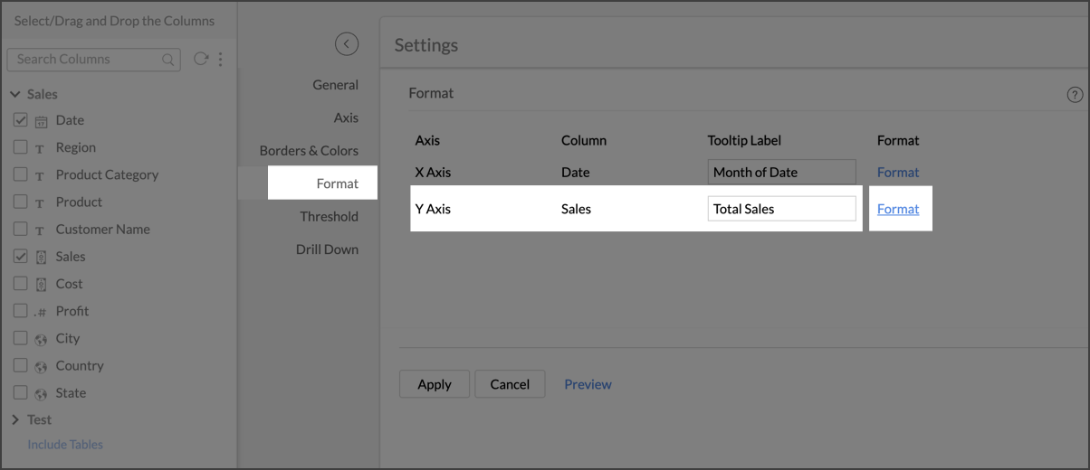
- The columns in X-axis and Y-axis of the report will be listed, along with Format option to its right.
- Click the Format option to format the column. Follow the steps mentioned in Method 1 to format the column.


Note:
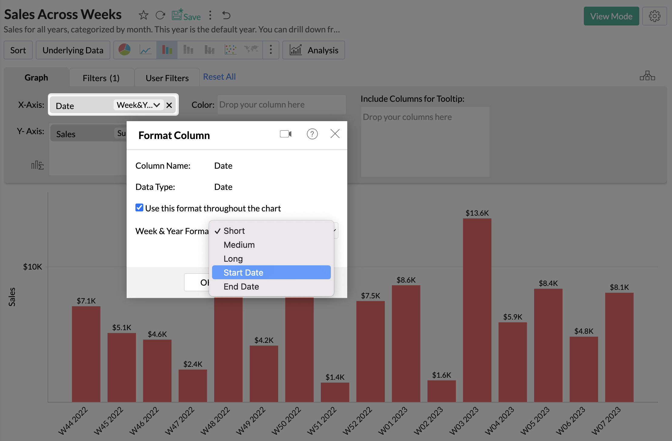
- You can use all the three methods to format Week & Year Format of the columns with Date data type.
- The changes made will be applied only to this report. There are five Week & Year Formats available - Short, Medium, Long, Start Date, and End Date.
- You can also change the Week & Year format for the entire workspace. Click here to learn more.

Legend Settings
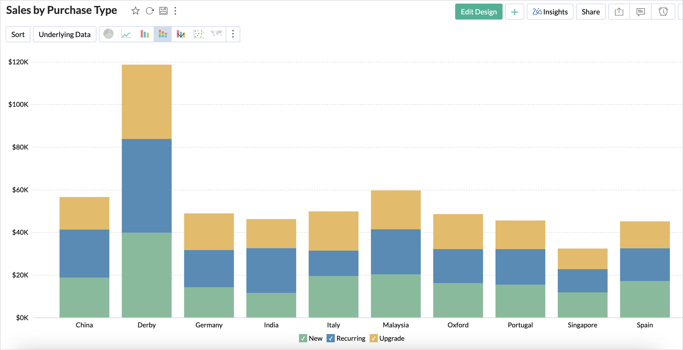
The legend in a chart provides a quick overview of the different data series involved in the chart along with the color associated with each series. Legend consists of Legend Title and Legend Items. Each legend item consists of a colored box that indicates the data series and the name of the data series.
To customize the legend:
- Open the corresponding chart and click Settings option in the toolbar.
- The Settings screen will open. Click the Legend tab.
- The Legend tab provides various options to customize the legend properties. Set the options as required and then click Apply.

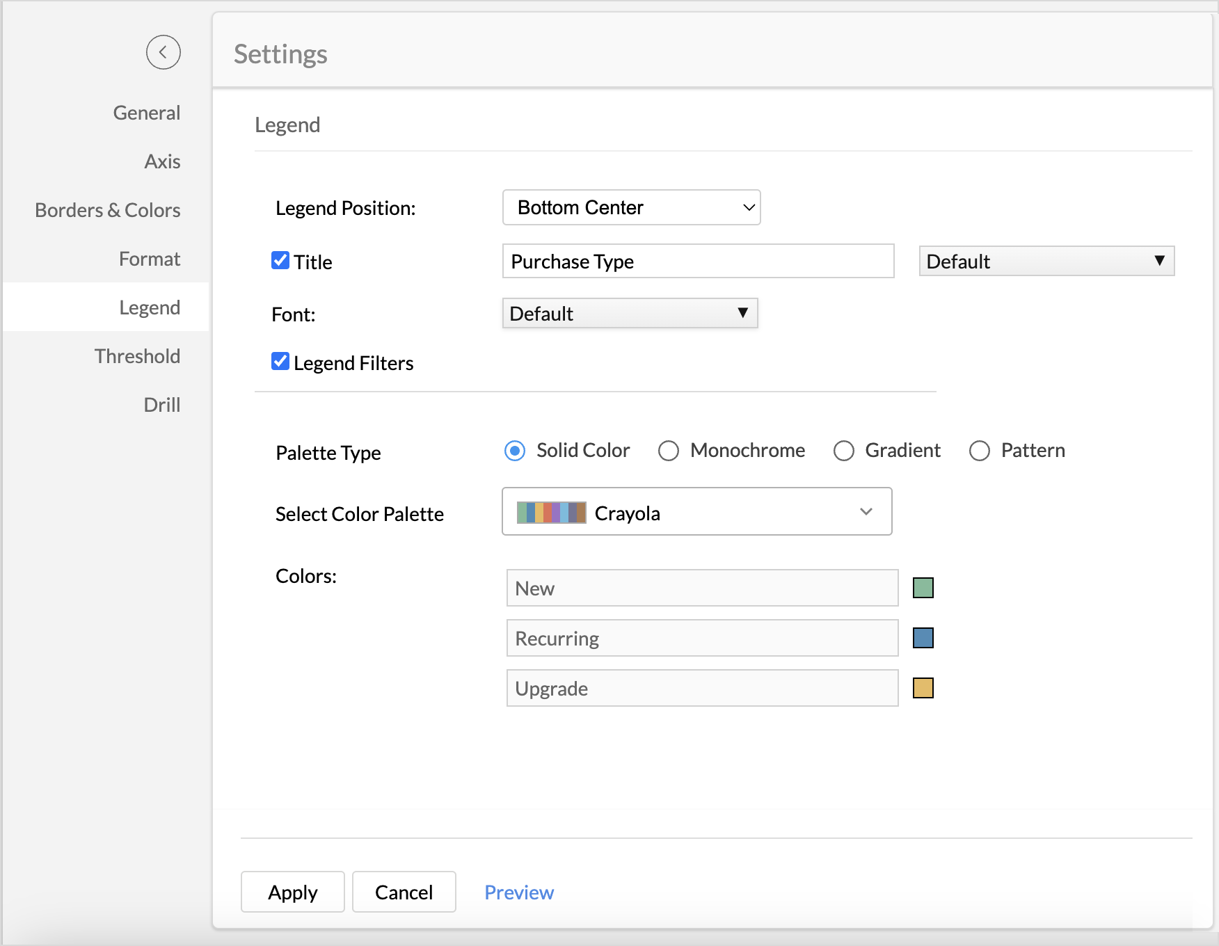
The following table describes the options available in the Legend tab:
| Option | Description |
| Legend Position | This option allows you to set the position of the Legend in a chart. Supported positions are:
|
| Title | This option has two fields. The checkbox allows you to show or hide the legend title. In the text field, you can change the default title of the legend. You can also customize the font style of the legend title. |
| Font | Using this option you to customize the font style of the legend items. |
| Legend Style | Specify whether to display the legend items with or without the corresponding values. You can also customize the format to display data using the Format link. |
| Legend Filters | Select this option to enable legend items to act as filters in chart view mode. This allows users to dynamically filter the data series using the legend items. Refer here to know how to use the Legend filters to filter a data series. |
| Palette Type | Select the Palette type. Zoho Analytics offers three types of palettes. They are:
|
| Color Palette | Select the color palette to apply color for your data series. You can also select a color palette based on the palette type that is selected. Zoho Analytics has a predefined set of color palettes that you can choose from. Apart from this, you can also add new color palettes. |
| Colors | Using this option, you can override the colors of the individual series of the chart. Once you override the palette, you will find the following options.
|
You can also change the color of each data series using the corresponding legend item in chart Edit Mode. Refer to the Customizing Chart Colors section to know how to customize chart color using a legend.
Adding Threshold
Zoho Analytics provides you an option to draw threshold lines in a chart to highlight specific values. Threshold lines can be added horizontally or vertically at a fixed value on the X or Y-axis of a chart. A threshold will be useful to highlight specific values for better visualization and for comparing the data series.
For example, you can set a threshold line to represent maximum sale target, and another to represent the lowest acceptable sales target to spot regions that are out of sales target easily. Zoho Analytics allows you to add two types of threshold lines - Static and Dynamic Threshold lines.
Static Threshold: The Static threshold function allows you to set a constant value as a threshold line.
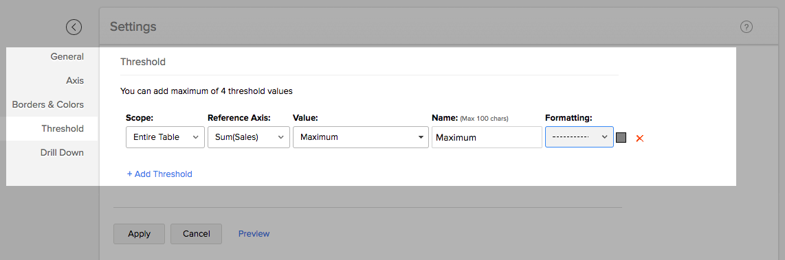
To add a threshold in your chart:
- Open the corresponding chart and then click Settings option in the toolbar.
Click the Threshold tab in the Settings screen.
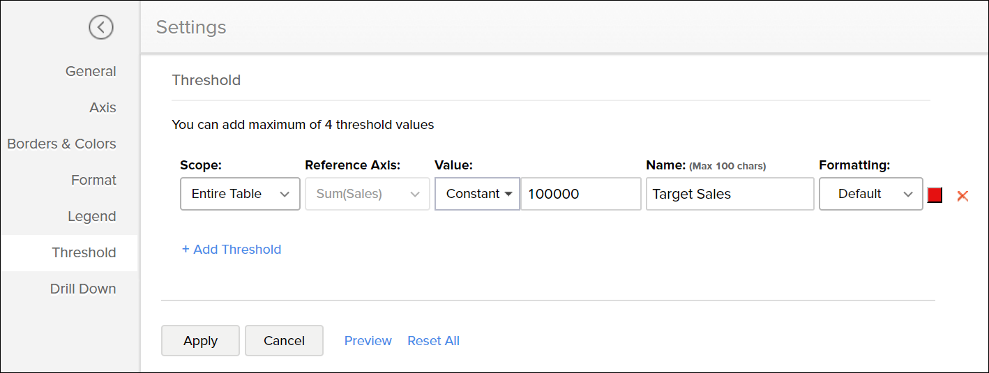
- Select the Scope of the Threshold, the available options are
- Entire Table: Applies the same threshold for the entire table.
- Per Cell: Applies a threshold for a single cell. This option is recommended while creating dynamic thresholds.
It is not applicable for charts with multiple columns in Y axis.
- Select the reference axis from the Reference Axis drop-down.
- Select Constant from the Value drop-down and enter a value.
- Enter the desired name of the threshold line in the Name text box.
- Select the line type and color from the Formatting drop-down.
- You can add more thresholds using the +Add Threshold link.
- Click Apply once you have added required threshold lines.

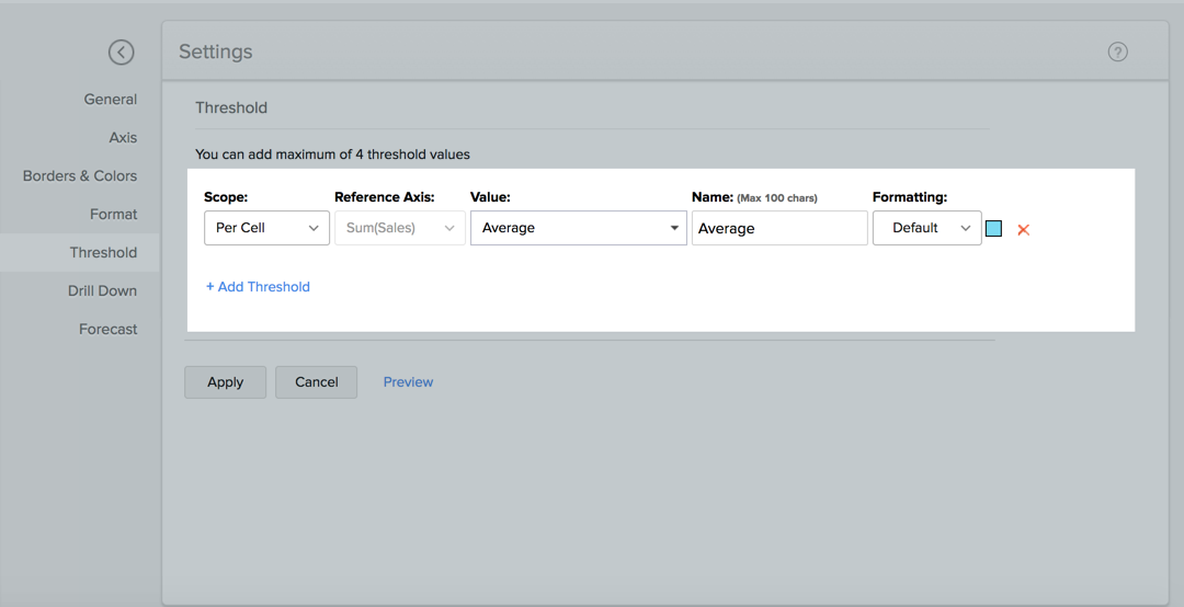
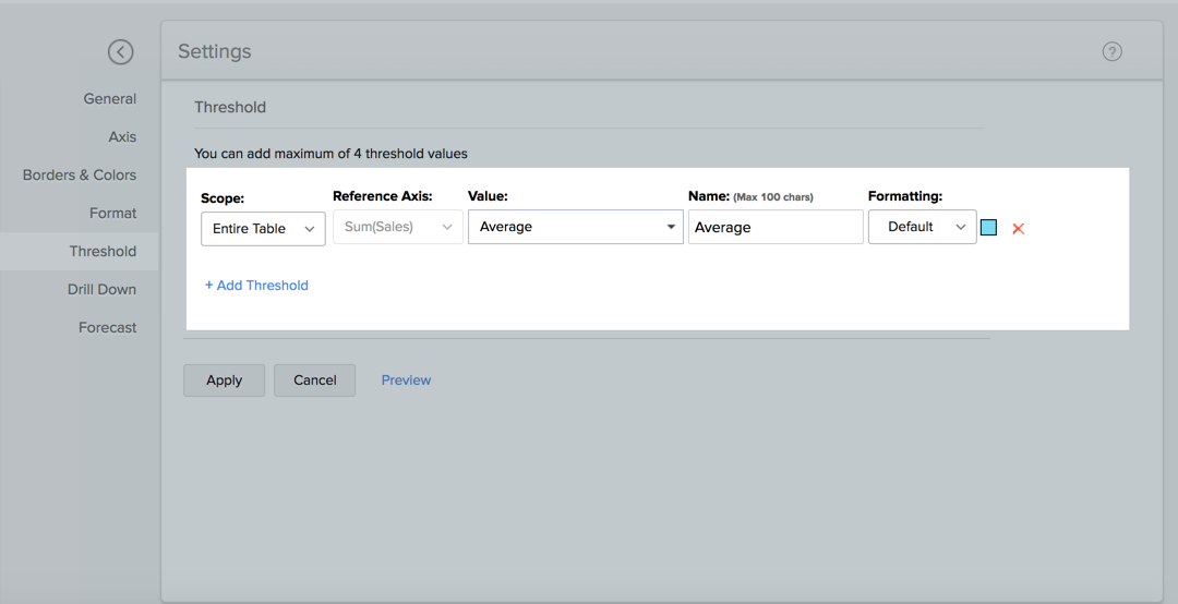
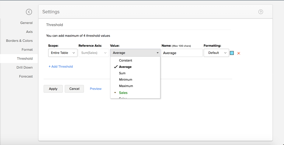
Dynamic Threshold: The Dynamic threshold feature allows you to apply dynamic functions such as Sum, Average, Minimum and Maximum over the columns in your reference axis or over a different column.
To add a threshold in your chart:
- Open the corresponding chart and then click Settings option in the toolbar.
- Click the Threshold tab in the Settings screen.
Select the Scope of the Threshold, the available options are
- Per Cell: Applies a threshold for a single cell. Not applicable for columns with multiple Y axis.
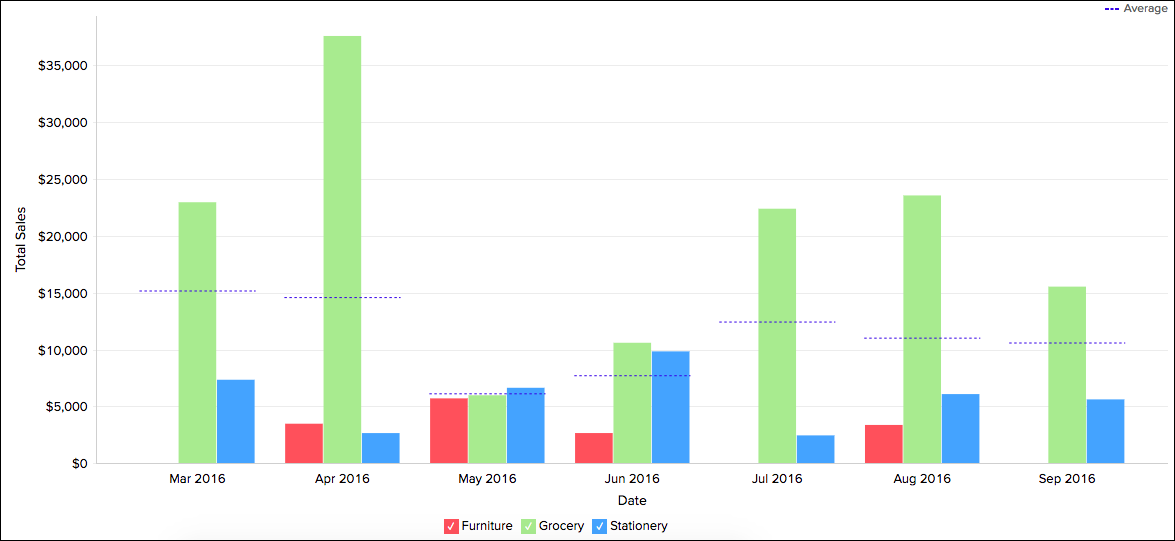
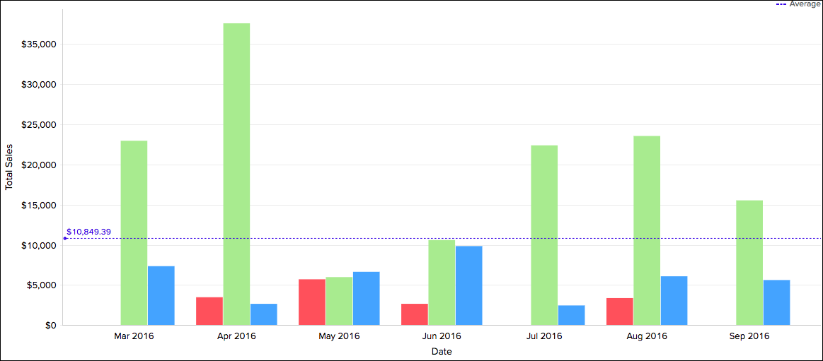
Shown below is a sample screenshot displaying the threshold line based on the per cell. It displays the average sales per cell.
- Entire Table: Applies the same threshold for the entire table.
Shown below is a sample screenshot displaying the threshold line for the entire table. It displays the average sales for the entire table.
- Per Cell: Applies a threshold for a single cell. Not applicable for columns with multiple Y axis.


- Select the reference axis in the Reference Axis drop-down.
Select the function that you wish to apply from the Value drop-down. You can add dynamic functions such as Sum, Avg, Min, and Max on the reference axis column or on a different column.
- Enter the desired name of the threshold line in the Name text box.
- Select the line type and color from the Formatting drop-down.
- You can add more thresholds using the +Add Threshold link.
- Click Apply once you have added required threshold lines.

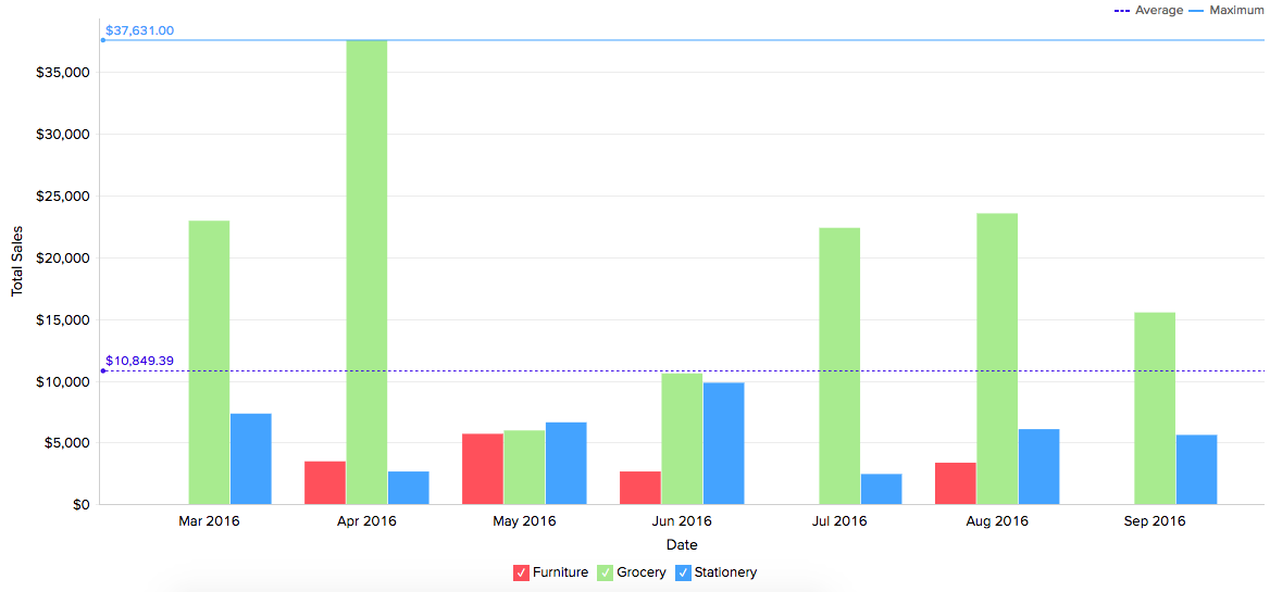
The following screenshot illustrates a chart with two threshold lines.
You can remove an existing threshold any time using the Remove link next to the corresponding threshold in the Settings screen.
Chart Drill Down Path
The (data) drill feature in Zoho Analytics enables you to get the granular details in a report. It helps to get insights from the specific categories or sections of the data.
The following are the steps to define a drill path for a chart:
- Access the Settings tab on the top right corner.
- Click the Drill tab.
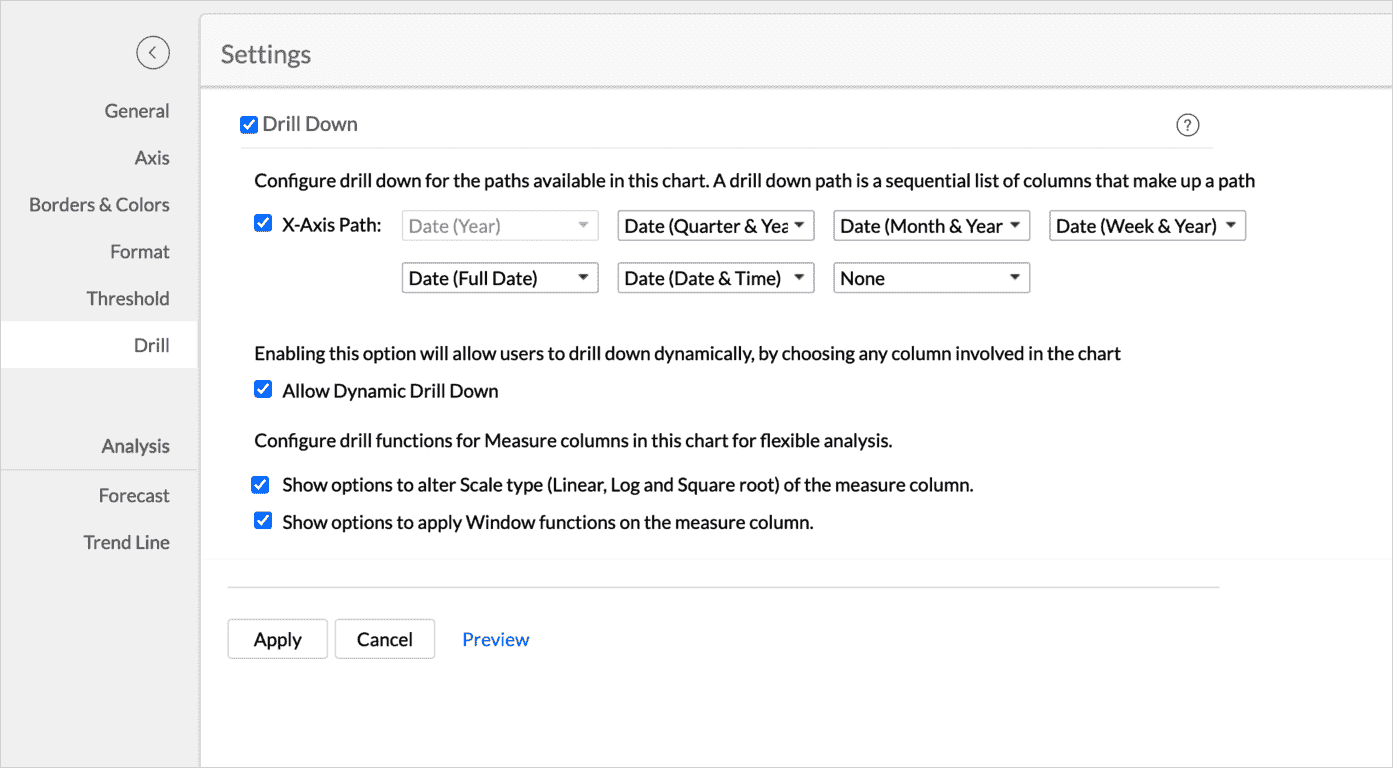
- Select the checkbox Drill Down to enable the capability
- Define the drill-down paths for the report.
- The Allow Dynamic Drill Down option helps users who access the report to drill down by choosing any column used in the chart.
- Additionally, the drill function for the measure columns can also be customized as needed.
Enabling the Show options to alter Scale type allows users who access the report to change the scale type (Linear, Log, and Square root) of the report. - Enabling the Show options to apply Window functions on the measure column allows users to change the advanced summary functions (Running Total, % of Total, Difference From, % of Difference From, % of Previous Value) used in the report.
- Additionally, the drill function for the measure columns can also be customized as needed.

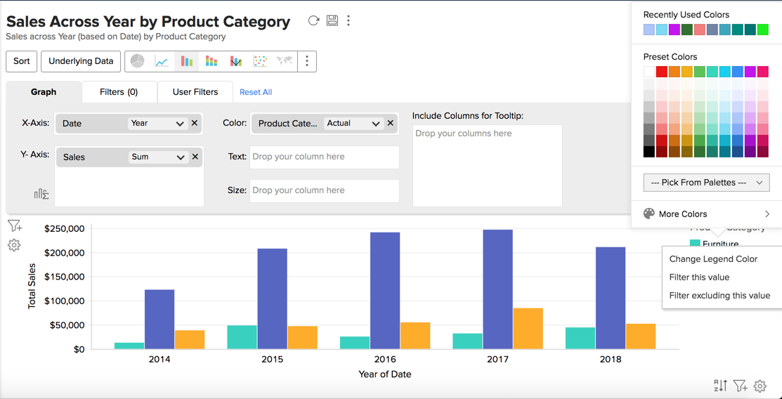
Customizing Chart Color
In Zoho Analytics, when you create a chart, colors to represent the various data series involved will be automatically assigned to your chart. This will be picked from the color palette assigned to your chart. However, you can change the default colors of the data series.
To customize the data series colors in your chart:
- Open your chart in Edit Design Mode.
- Click on the color box of the legend item of the data series for which you want to change the color.
- Select Change the Legend Color option in the menu that shows up.
- A color picker dialog opens. Choose the required color from the full range of colors available. You can also specify the color by specifying the RGB value or the Hexadecimal value in the corresponding fields provided or choose a color from the listed color palette.
- Click OK after choosing the required color.
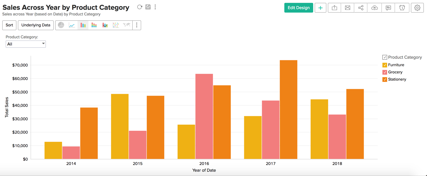
The newly chosen color will show up in your chart for the corresponding data series as shown below.
You can also customize the legend colors using the Legend tab in the Settings option. Refer to the legends section to learn more.
We have now seen how to customize the chart colors for a single chart. It is also possible to change the chart colors for all the charts in your Workspace. Refer to the color palette document to learn more.
Note:
- You can customize the color of the single data series using the Chart Color Fill option in the Borders & Colors tab in the Settings screen.